What "vaporwave" actually means for a workspace
Vaporwave started as a music-and-visual internet aesthetic in the early 2010s — a nostalgic, slightly ironic remix of 80s/90s consumer imagery: sunset gradients, Roman busts, wireframe grids, chrome type, VHS haze. As a vaporwave codex skin, you're borrowing that visual language: soft magenta-to-cyan gradients, a glowing horizon line, a dreamy low-stakes calm. Where cyberpunk is aggressive and high-contrast, vaporwave is the opposite — mellow, hazy, easy. That difference is the whole reason to pick it, and it also creates the one technical challenge you have to solve.
The pastel problem (and how to beat it)
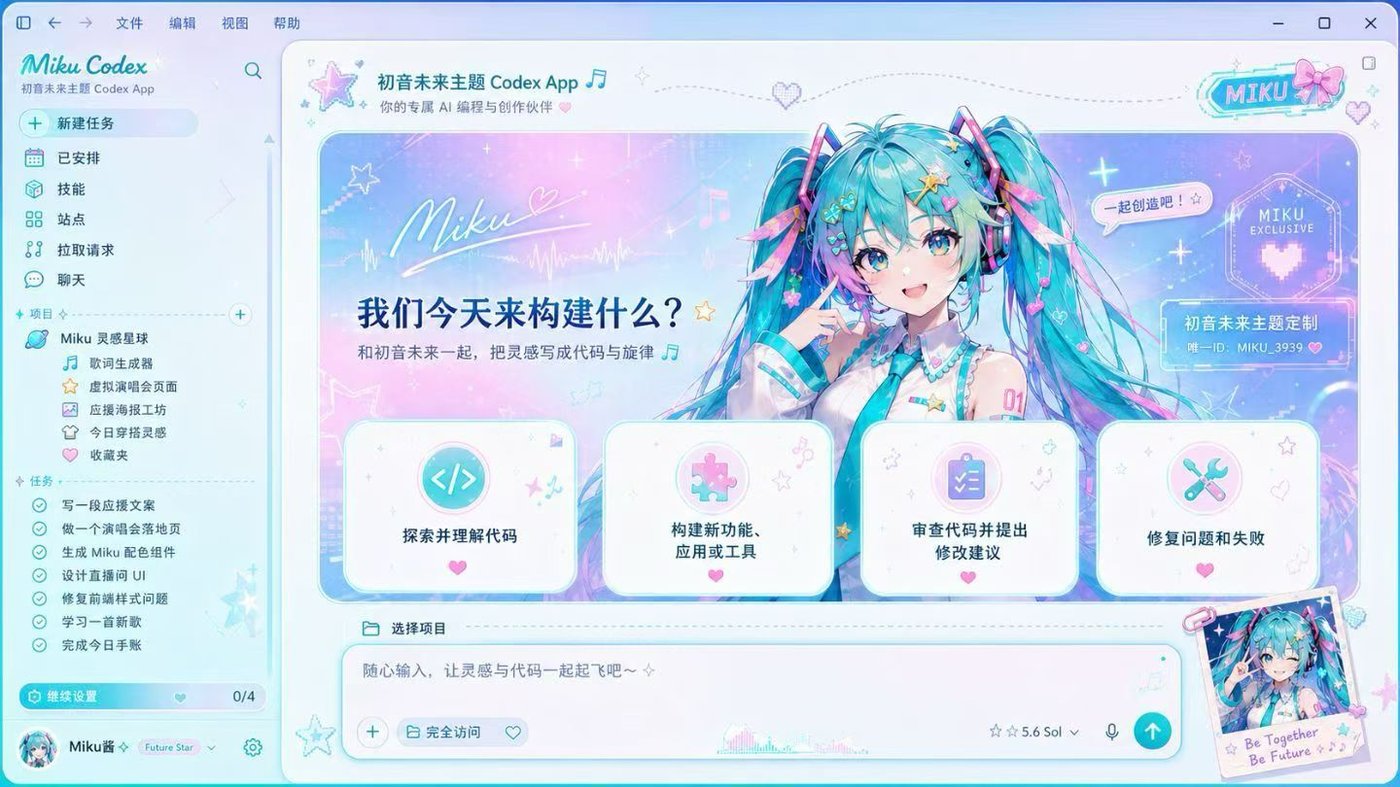
Here's the honest tradeoff: the pastels that make vaporwave beautiful are, by definition, low-contrast. A soft lavender and a soft teal sit close together in lightness, which is soothing to look at — and terrible to read code against. Drop a raw pastel gradient behind your editor and your syntax highlighting turns to mush. This is the single thing that separates a vaporwave skin that looks great in a screenshot from one you can actually work in.
The solution isn't to abandon pastels — it's to build contrast into the reading layer, not the background:
Push the gradient behind glass
Raise panel opacity so the code sits on a frosted layer above the gradient. The pastels glow through the edges; the text sits on a calm surface. This is the classic vaporwave "frosted chrome" look and it's also what saves readability.
Darken the horizon behind text
A little background dim under the reading column deepens the pastels just enough to give your foreground text room. You keep the sunset; you lose the mush.
Let one pastel be the accent
Pick a single slightly-more-saturated pastel (a hot-pink or an electric cyan) for links and the active item so there's one clear focal color amid the softness.
Gradient direction matters more than you'd think
Vaporwave lives on gradients, and the angle changes the whole feel. A horizontal sunset (light at the horizon line, darker above and below) mirrors a real skyline and leaves a natural dark band for your code. A diagonal gradient feels more energetic but can drag brightness right across your reading column — usually you want to rotate it so the brightest part sits in the banner or a corner, not behind the text. In the generator you can reposition the image so the gradient's bright zone lands where there's no code.
The best vaporwave source images
Look for wide gradient scenes with a clear horizon: a sunset over an ocean, a synthwave grid receding into a pink sky, a chrome sphere on a gradient field. Avoid busy collage-style vaporwave art (statues, palm trees, glitch text all at once) for the background — it's gorgeous as a poster but too noisy behind code. Save the busy stuff for the banner strip.
Vaporwave skin vs pastel theme
If you love the pastel colors but don't want to fight a gradient's contrast, a pure-color codex theme gives you the soft palette with reliable readability and zero install. If you want the full sunset-behind-your-workspace dream, that's a codex skin. Trying a free pastel theme first is a good way to find your palette before committing to a background.
Vaporwave Codex skin FAQ
Why does my vaporwave skin make code hard to read?
Pastels are inherently low-contrast. Raise panel opacity so code sits on a frosted layer above the gradient, add a little background dim under the reading column, and pick one slightly-saturated pastel as your accent. You keep the dreamy look and get your contrast back.
What gradient direction works best?
A horizontal sunset (bright horizon, darker above/below) leaves a natural dark band for code. Reposition the image so the brightest part of the gradient sits in the banner or a corner, not behind your text.
Where do I find good vaporwave wallpapers?
Wide gradient scenes with a clear horizon — synthwave grids, sunset skies, chrome-on-gradient. Upload your own; it's processed entirely in your browser and never uploaded.
Can I switch between vaporwave and other looks?
Yes. With the All-Skins Vault you can swap endlessly — vaporwave for daytime calm, cyber for night. One-click restore is always included.
Is it safe for my IDE?
Yes — a local cosmetic layer that never touches the Codex binary and restores in one click. See the
install & restore guide.
 vaporwave
 vaporwave
 vaporwave
 vaporwave
 vaporwave
 vaporwave